Visualising Networks
by James Hollway
Source:vignettes/articles/visualising-networks.Rmd
visualising-networks.RmdStatic preview:
This is a static, read-only preview of the “Visualising Networks”
tutorial. To keep it a preview, the code output and exercise solutions
are not shown here, and the quizzes are replaced with notes like this
one. Install the package and run run_tute() at the R
console to work through the tutorial interactively — running the code,
seeing the results, and getting hints, solutions, and quizzes.
Why graph
Network visualisation is non-trivial; indeed it is very important, for at least two reasons.
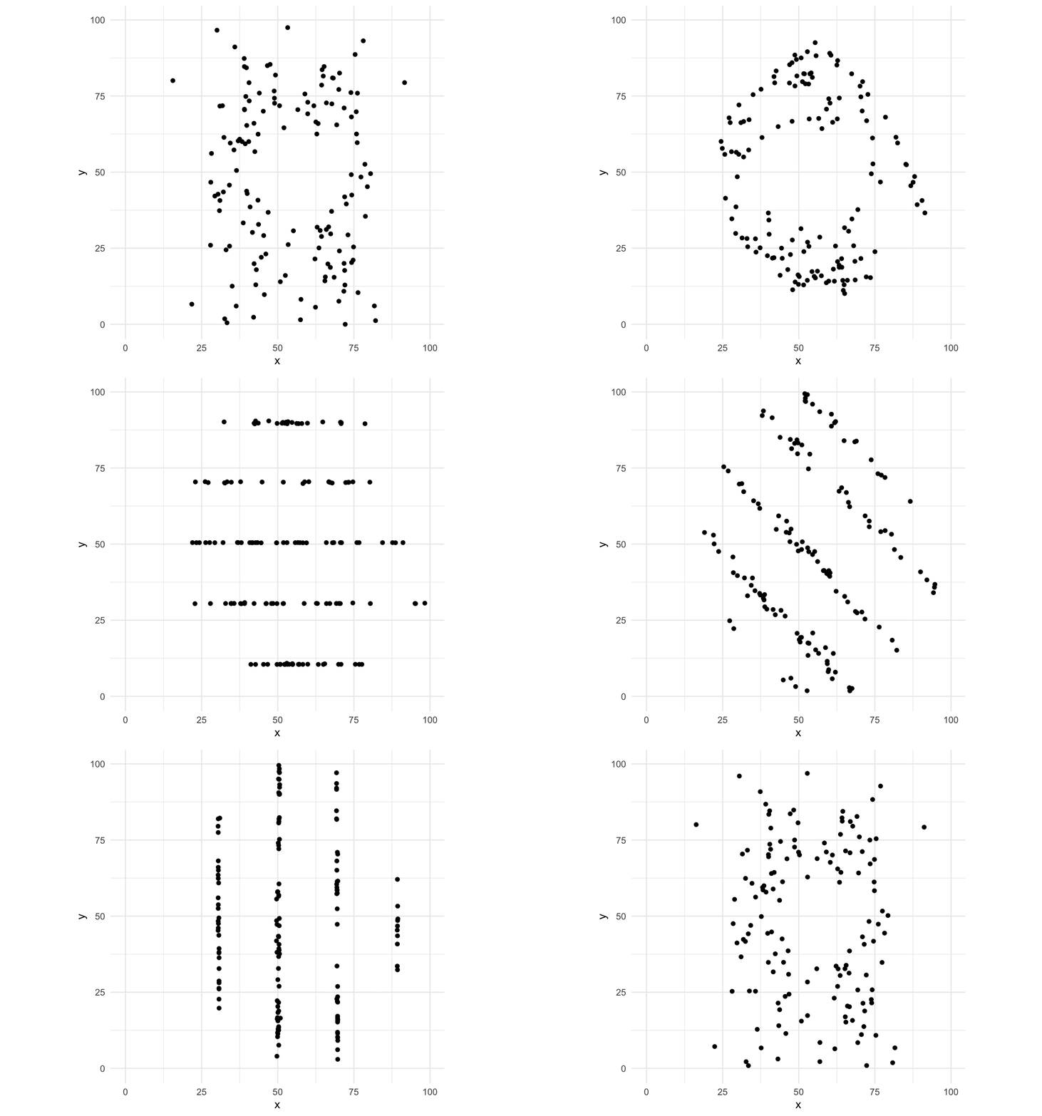
First, visualisation is a crucial part of the process of data analysis. As a first step, network visualisation – or graphing – offers us a way to vet our data for anything strange that might be going on, both revealing and informing our assumptions and intuitions. The following image relates to the famous Anscombe’s quartet, which shows how different datasets can have identical statistical properties that are only revealed to be very different when graphed.
As Tufte (1983: 9) said:
“At their best, graphics are instruments for reasoning about quantitative information. Often the most effective way to describe, explore, and summarize a set of numbers – even a very large set – is to look at pictures of those numbers”
All of this is crucial with networks. Drawing network graphs is key to exploring and understanding both the global structure of a network as well as smaller-scale structures such as nodal positions or communities within it.
Second, visualisation is a crucial part of communicating to others the lessons that we have learned through investigation. As Brandes et al (1999) argue, visualisation involves thinking about the substance of what you are trying to communicate, how to design it so that it is ergonomic and (ideally) aesthetic, and which algorithm is most appropriate to lay out the graph informatively. The aim is to offer a concise and precise delivery of insights.
There may be some dead-ends and time-sinks involved in visualising your data, but it is worth taking the time to explore your data and experiment with ways to make what you have learned over a longer period of time evident to others in a shorter period of time.
Catching up: This
tutorial assumes you know what a
network is, made up of
nodes and
ties , and that you can load or make network data in R. If
any of that is hazy, work through the manynet tutorials
first: run run_tute("Making") and
run_tute("Manipulating") at the R console, or read their
static versions on the manynet website.
New to network vocabulary?: Throughout this tutorial, key terms are italicised: hover over them for a definition, and a full glossary of the terms used appears at the end of the tutorial.
Aims
By the end of this tutorial, you should be able to:
Choose your own data: The worked examples below
mostly use fict_lotr, a fictional network of affinities
among Lord of the Rings characters bundled with manynet,
plus a couple of classical datasets. But wherever there is an exercise
box, you are encouraged to swap in a network that interests
you. Remember the three flavours of bundled data as a rough
difficulty ladder — Classic (ison_*, small
& tidy), Fiction (fict_*, mid-sized
& fun), Real-world (irps_*, larger
& realistic) — and that you can browse the full list with
table_data().
Try it yourself:
This section includes an interactive quiz in the live tutorial — run
run_tute() at the R console to try it.
Getting started
On this page: Plotting approaches · Graphing approaches · Your first graph · Free play
Before we start, let’s load the packages used in this tutorial. autograph provides the graphing and plotting functions (and loads manynet, which provides the network data and manipulation verbs), and netrics provides the one network measure we will map onto graphs: each node’s degree.
Plotting approaches
To understand graph and network visualisation with autograph, it is useful to review the different approaches already taken in R. Plotting in R is typically based around two main approaches:
- the ‘base’ approach in R by default, and
- the ‘grid’ approach made popular by the famous and very flexible ggplot2 package.1
In the case of base R graphics, plots are essentially written straight to the plotting device. This means that they are not easily modified after the fact: you would need to replot the whole thing to change something. Moreover, while there is an admirably clean aesthetic to base R graphics, it can be difficult to modify or extend them to your needs.
In the case of grid graphics, plots are built up in layers, and thus
can be modified after the fact. That is, you can initialise a plot using
ggplot2::ggplot(), specifying the data and mapping
variables to various aesthetic features, and then add layers to it using
+ to add further points and lines, but also titles,
legends, etc.
The following figure illustrates the difference between these two approaches.2 Run the code to compare the two plots. (There are buttons to run the code you have entered, to start over, and — where available — to receive hints and solutions. You will use these throughout the tutorial.)
plot(mtcars$hp, mtcars$mpg,
     main = "Base R: MPG vs Horsepower",
     xlab = "Horsepower",
     ylab = "Miles per Gallon",
     pch = 19,
     col = "blue")
ggplot(mtcars, aes(x = hp, y = mpg)) +
  geom_point(color = "blue") +
  labs(title = "ggplot2: MPG vs Horsepower",
       x = "Horsepower",
       y = "Miles per Gallon")
Graphing approaches
Approaches to plotting graphs or networks in R can be similarly divided:
- two classic packages, igraph and sna, both build upon the ‘base’ R graphics engine,
- newer packages
{ggnetwork}and{ggraph}build upon a ‘grid’ approach.3
Let’s see how the fict_lotr network would be plotted
using igraph and ggraph, adding a title to
each to facilitate comparison, but otherwise relying on default
behaviour.
plot(as_igraph(fict_lotr),
     main = "igraph: fict_lotr")
ggraph::ggraph(as_tidygraph(fict_lotr)) +
  ggraph::geom_edge_link() +
  ggraph::geom_node_point() +
  ggtitle("ggraph: fict_lotr")
We can see here that igraph plots the network in a fairly basic way, straight to the plotting device (window). By default, it uses a force-directed layout (see the Layouts section below),4 colours the nodes orange, and prints node labels if they have them. However, the layout is not optimised for the size of the plotting window, the node labels are regularly overlapping, and the orange colour with black borders is not particularly appealing or helpful for label legibility. It only works with ‘igraph’ objects.
In contrast, ggraph offers the trademark flexibility of the grammar of graphics approach. However, it requires the user to build up a plot from the ground up, which can be daunting for new users and fiddly even for experienced ones. Four lines are required to get even a basic plot, with an additional line required if a grey background is not desired. No labels or other information are added by default, and would also require additional lines. It works with ‘tidygraph’ objects, which are an additional layer on top of ‘igraph’ objects.
Your first graph
autograph builds upon these packages, but takes a somewhat different approach. It builds upon the ‘grid’ approach of ggplot2 and ggraph, lending itself to the additional layering and flexibility of those packages. Because it depends on the coercion routines available in manynet, it can be used with network-related objects from most common network analysis packages — igraph, network, tidygraph, matrices, edgelists, and more — without you needing to convert anything first. Unlike those packages, though, it offers concise and easy-to-use functions with sensible defaults for most common use cases, using the information that is available in the network object.
The first thing you will want to do when you import or create a new
network dataset is draw it. Compared to the igraph and
ggraph examples above, autograph::graphr()
offers a much more concise way to draw the network. Try it
now.
graphr(fict_lotr)Note everything that happened without being asked:
graphr() recognised that the network is
labelled and printed node labels — but only for the most
central characters, since 36 labels at once would hide the network
behind them (the next page shows how to choose differently), chose a
deterministic layout (so you get the same picture every time), sized and
spaced the labels to minimise overlap, and dropped the axes and grey
background that mean nothing for networks. Because the network is
undirected , there are no arrowheads; for a
directed network, graphr() would draw them
automatically.
Try it yourself:
This section includes an interactive quiz in the live tutorial — run
run_tute() at the R console to try it.
The package also offers methods for plotting statistics related to
networks (e.g. degree
distributions ) and models of them (e.g. goodness-of-fit
plots). We will get to some of these later in this tutorial, and others
are demonstrated in the tutorials of other {stocnet}
packages. autograph also offers consistent theming across
graphs and plots, so that you do not need to keep specifying the same
options over and over again.
Free play
Your turn: before going any further, graph a network of your own choosing. Any of the networks bundled with manynet will do — here is one suggestion per flavour:
| Classic (small, easy) | Fiction (moderate) | Real-world (larger) |
|---|---|---|
ison_adolescents (friendships among eight
teenagers) |
fict_greys (Grey’s Anatomy hook-ups) |
irps_911 (the 9/11 hijackers and their associates) |
Then note what graphr() decided without being asked.
Were all the nodes labelled, some of them, or none? Are there
arrowheads? More than one node shape? A legend? Each of those decisions
was read off the data, and each is one you will learn to take over in
the pages that follow.
In the following pages, we’re going to go through a number of different ways of taking control of the graphing process. Click ‘Next Topic’ to continue.
In brief:
graphr() graphs any manynet-compatible network object with
sensible defaults inferred from the data: labels where the network is
labelled (and, where it is large, only for the nodes that stand out),
arrowheads where it is directed, a deterministic layout, and no chart
junk. It returns a ggplot2 object, so anything you can do
to a ggplot — adding layers, titles, scales with + — you
can do to a graph.
Labels and titles
On this page: Labels · Titles
In that first graph, graphr() made two decisions about
text on your behalf: which nodes to name, and that the graph needed no
title. Names and titles are the first things a reader looks for, and so
they are the first things we will take control of.
Labels
With our fict_lotr example above, because the network is
itself labelled, graphr() adds node labels. If you do not
want any labels, you can remove the names from the network before
passing it on to graphr(), or more simply use the argument
labels = FALSE.
graphr(fict_lotr, labels = FALSE)Without the labels, the structure of the network is clearer and easier to interpret, though we lose the information about which node is which character. Which you prefer depends on what the graph is for: exploring who-is-who, or communicating overall structure.
But this is not really a choice between all and nothing.
fict_lotr has 36 nodes, and 36 labels would cover the very
network they describe, so graphr() labelled only the
handful of most central characters and told you so. Ask for all
of them with labels = TRUE and compare.
graphr(fict_lotr, labels = TRUE)You can decide how many to label by passing a number. This is a depth of ranks rather than a count of nodes, so characters tied at the cut are labelled together — ask for the top three and you may get four names.
graphr(fict_lotr, labels = 3)By default the nodes are ranked by their
degree , the number of ties each node has, so the names you
see are those of the best-connected characters. You can say so
explicitly, and combine it with a number, by naming the number:
labels = c(degree = 5).
And when you know exactly who matters to your argument, you can just
say so — by name, or with any logical vector of the nodes. Here
node_attribute() pulls the Race attribute out
of the network as a vector, so that we can ask which characters are
hobbits.
graphr(fict_lotr, labels = c("Frodo", "Gandalf")) +
  ggtitle("Named outright") |
  graphr(fict_lotr, labels = node_attribute(fict_lotr, "Race") == "Hobbit") +
  ggtitle("Every hobbit")
Going further: By
default graphr() repels labels away from each other and
from nodes so that they do not overlap. Two further arguments offer
finer control: label_repel = FALSE places labels at a fixed
offset instead, and label_dist controls how far labels sit
from their nodes (in points). Degree is only one reason a node might be
worth naming: labels also accepts
"betweenness", "cutpoints", or
"random", which single out nodes for reasons that the
netrics tutorials introduce. On a
two-mode or multilevel network, a selection is ranked
within each mode or level, so that a dense level cannot crowd the others
out of the labelling.
Titles
autograph works well with both ggplot2
and ggraph functions that can be appended to create more
tailored visualisations. Let’s try this by adding a title to a plot.
Append (with a +) labs(title = ) to
add a title to a plot, say “My graph”, and then add also a subtitle (an
argument to that function), say “I did this”.
Note that you can also use ggtitle() to do the same
thing, but if you just remember labs() you can also use it
to add labels for x and y axes, and for some legends
(see Legends on the next page).
In brief:
labels chooses which nodes to name — all of them, none, the
top few by degree, or the ones you name yourself — and
label_repel/label_dist fine-tune their
placement. labs() (or ggtitle()) adds titles
and subtitles. A graph that leaves your hands should be readable without
you standing next to it explaining.
Aesthetics
On this page: Shaping · Colouring · Sizing · Ties · Arrows · Legends · Free play
Once we have an initial graph of our network, we can start to explore
features of the network and its structure in more detail. There are a
number of different dimensions network researchers can play with to
illustrate different aspects of the network. On her excellent and
helpful website, Katya Ognyanova outlines some of these dimensions.
The table below names the graphr() argument for each of
them, beside a small graph that shows what it changes. Where the table
says automatic, graphr() reads the feature off the
data itself: the direction, reciprocity, or sign of the ties.
| Nodes | Ties | ||||
|---|---|---|---|---|---|
| Shape | 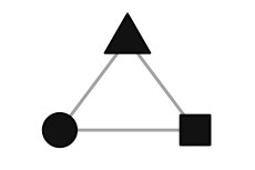 |
node_shape= |
Shape (curve) | 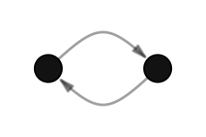 |
automatic (reciprocated ties),
edge_bundle=
|
| Size | 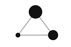 |
node_size= |
Size (width) | 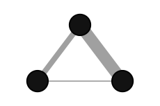 |
edge_size= |
| Colour (categories) |  |
node_colour=/
node_color=
|
Colour | 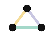 |
edge_colour=/
edge_color=
|
| Colour (numbers) | 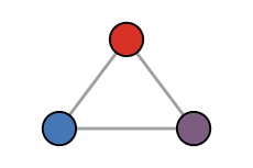 |
node_colour=/
node_color=
|
Linetype (dashed) | 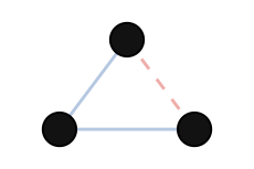 |
automatic (signed ties) |
| Group | 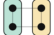 |
node_group= |
Arrows | 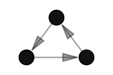 |
automatic (directed ties),
edge_arrows=
|
Beginner note: As
the table shows, both spellings work: node_colour= and
node_color= are the same argument, as are
edge_colour= and edge_color=, and the same
goes for ggplot2‘s colour/color
aesthetics and
scale_colour_*()/scale_color_*() functions.
This tutorial is written in British English and so says ’colour’
throughout, but you should use whichever spelling comes naturally to
you.
The named arguments in the table above cover the aesthetics you will
reach for most often. Several other visual features are marked
automatic: graphr() reads them off the data and
sets them for you, so that a first graph already reads correctly without
any tweaking. In particular:
-
arrowheads are drawn (and trimmed back from the
node) where the network is
directed , and omitted where it is
undirected , though
edge_arrows=can resize or remove them; - ties curve apart slightly where a dyad is reciprocated , and are drawn straight otherwise;
- ties are drawn dashed where a signed network marks them negative, and solid where positive;
- self-ties (loops) are drawn where the network is complex ; and
- edges are drawn semi-transparent, so that denser bundles of ties read as darker.
Most of these you do not set by hand — but because every graph is a ggplot2 object, you can always override them by dropping down to ggraph (see the Going further with ggraph section near the end of this tutorial).
The position of the nodes gets a topic of its own (Layouts),
as do isolates= and edge_bundle= (Ew,
hairballs), and you met labels= on the previous page.
This page takes the rest in turn.
Each of the mapping arguments can be given either a literal value
(e.g. node_size = 6) or, more interestingly, the name of a
node or tie attribute in the data
(e.g. node_colour = "Race"), in which case
graphr() maps the attribute to that aesthetic and adds a
legend where appropriate. Let’s go through some of these options in more
detail.
Shaping nodes
One of the first things we might be interested in doing is
understanding better the distribution of some categorical variable. Our
fict_lotr dataset contains a variable called
Race, so let’s try and change the shape of the nodes by
this variable. Following the syntax shown in the table above, we just
need to reference the variable name in the node_shape
argument. Print the network first to check the attribute’s
(case-sensitive) name, then graph it.
fict_lotr
graphr(fict_lotr, node_shape = "Race")
We can see here that there are six different races present.5 Unfortunately, this is a few too many different categories to be effectively distinguished by shape: at a glance, can you quickly find the triangles among the squares? Shape works best for two or three categories at most.
One place where shape excels, though, is distinguishing the node sets
of a multimodal network — and there graphr() does it for
you. For a
two-mode network, nodes in the first mode are drawn as
circles and nodes in the second mode as squares, with a “Mode” legend
added automatically; were a third node set mapped to shape, it would be
drawn as triangles. Graph the ison_southern_women
network, where the women (first mode) appear as circles and the events
they attended (second mode) as squares.
graphr(ison_southern_women)Colouring nodes
Let’s try instead colouring the nodes by this “Race” variable. It is very similar to the shape example above. Can you complete the code yourself?
That’s much easier to read. Note how a legend has been added automatically, using the colours of whatever theme is currently set (more on themes soon).
How should we interpret this graph? Since the same colours seem to be clustered together, with the humans and hobbits each clustered together in the centre of the graph, and the elves clustered towards the left, we might infer that there is some homophily going on here — that characters tend to be connected to others of the same race — a hypothesis to test properly in another tutorial. Interpreting an attribute-coloured graph like this is often the first, informal step toward a more formal analysis.
An alternative to colouring the nodes is to use the
node_group argument to highlight groups in a network. This
puts a shaded area around nodes of the same group. For rather spatially
clustered distributions, this can be a very effective way to show
groupings, but it is sensitive to the layout used: if nodes of the same
group are not close together, the shaded areas can overlap and make the
graph harder to read.
graphr(fict_lotr, node_group = "Race")Note that node_colour and node_group can be
used together, either to highlight different groupings, or to emphasise
group assignment where the groups interpenetrate, as described
above.
A continuous variable
Race is a category. What if the attribute we care about is a number?
The fict_lotr dataset does not contain any numeric node
attributes, but we can create one rather easily from the network itself.
Let’s use each node’s
degree , which is the number of ties incident/connecting to
the node.
Beginner note:
The |> symbol below is called a ‘pipe’. It passes the
result of the expression on its left on to the function on its right, so
the code below means “take fict_lotr, then add a
Degree attribute to its nodes, then graph it with node colour
mapped to that attribute”. Piping or ‘chaining’ functions like this is
very common in modern R, and we use it throughout these tutorials.
mutate() and the other dplyr-style verbs for
networks are covered in manynet’s “Manipulating Network
Data” tutorial.
fict_lotr |>
  mutate(Degree = node_by_deg(fict_lotr)) |>
  graphr(node_colour = "Degree")
graphr() has not given each degree a colour of its own,
as it did each race. A number has an order, and distances between its
values, that categories do not, so it is drawn as a gradient
instead — from the current theme’s base colour to its highlight — and
the legend becomes a colour bar. The rule graphr() follows
is simple: a numeric attribute that takes more than two different values
gets a gradient; anything else — text, a logical
TRUE/FALSE, or a number that takes only two
values — is treated as a set of categories.
Numeric attributes that come with the data work in just the same way.
ison_lawfirm records the age and
seniority of each lawyer in a law firm. Colour the
lawyers by age, and then by seniority. Do the older lawyers sit
together?
graphr(ison_lawfirm, node_colour = "age")Sizing nodes
Colour is not the only way to show a number, and it is rarely the
most precise. Our eyes compare sizes more readily than they compare
shades, which makes node_size the usual home for a
continuous variable. Size the characters by the degree we
calculated above.
fict_lotr |>
  mutate(Degree = node_by_deg(fict_lotr)) |>
  graphr(node_size = "Degree")
Larger nodes are now the better-connected characters, and a size legend has been added. Who turns out to be the most connected character in the fellowship?
Nothing stops you mapping the same attribute to both aesthetics at once. This costs nothing, and helps a reader who is looking at a small figure, a greyscale printout, or with a colour vision deficiency. Compare the three encodings of the same variable.
lotr <- mutate(fict_lotr, Degree = node_by_deg(fict_lotr))
(graphr(lotr, labels = FALSE, node_size = "Degree") + ggtitle("Size") |
    graphr(lotr, labels = FALSE, node_colour = "Degree") + ggtitle("Colour") |
    graphr(lotr, labels = FALSE, node_size = "Degree", node_colour = "Degree") +
    ggtitle("Both")) &
  theme(legend.position = "none")
Try it yourself:
This section includes an interactive quiz in the live tutorial — run
run_tute() at the R console to try it.
Tying up loose ends
All this works similarly with ties/edges. Just replace
node_ with edge_ in the arguments above, and
you can control edges’ size and colour. The following example uses two
classic networks that come with tie attributes:
ison_florentine, where each tie among the families of
Renaissance Florence belongs to a layer (marriage or
business), and ison_karateka, where each tie among the
members of a karate club has a weight (the number of
contexts in which the two members met). Run the code, then try
colouring the karate club’s ties by "weight" instead of
sizing them.
Now delete the two edge_ arguments and run the code
again: nothing changes. That is because some tie attributes are
recognised automatically: if a network contains a tie attribute called
weight, ties will be sized by weight without you asking,
and a tie attribute called layer (or type)
will be used to distinguish the ties of a
multiplex network. Naming your attributes accordingly can
save you some typing; for an attribute under any other name, the
edge_ arguments are how you ask.
Pointing arrows
So far our example network has been undirected. For
directed networks, graphr() adds arrowheads
automatically, pointing from the sender to the receiver of each tie, and
trims them back so they are not swallowed by the receiving node.
Arrowheads are also scaled automatically with the width of the ties:
thin ties get small arrowheads, thick ties get larger (but capped) ones,
and ties of width zero lose their arrowheads entirely. This means
arrowheads stay proportionate even when tie width is mapped from a
weight attribute, as in the ison_networkers
network of messages exchanged among early network researchers. Because
the arrowheads follow the tie width, setting edge_size
yourself resizes both together. Compare the automatic sizing
with a manually thickened version.
(graphr(ison_networkers) + ggtitle("Automatic") |
   graphr(ison_networkers, edge_size = 1) + ggtitle("Manual (edge_size = 1)"))
To change the arrowheads without changing the ties, use
edge_arrows. It is a switch that can also carry a value:
left alone, graphr() decides from the network;
edge_arrows = FALSE draws none, which suits a network where
the direction is already plain from the layout;
edge_arrows = TRUE insists on them; and a number gives
their length in millimetres, whatever the tie width. Draw the
same network with larger arrowheads, and with none.
Legends
Every mapping on this page has come with a legend, because a mapping
is unreadable without one. But a legend asks a reader to hold a colour
in mind while they hunt for it in the graph, and people are poor at
that: colour is not recalled reliably, even over a couple of seconds.
Labelling nodes directly asks less of them, which is why
graphr() labels nodes where it can, and why, above thirty
nodes, it labels the most central ones rather than none at all (see
Labels on the previous page). Keep a legend for what cannot be
written onto the graph itself, and keep it short.
While autograph adds legends where necessary, it can
only title them with what it knows: the name of the attribute. Take the
following figure, where we highlight the character with the highest
degree . Top is a logical attribute,
TRUE for one node and FALSE for the rest, so
by the rule above it is drawn as two categories rather than a
gradient.
fict_lotr |>
  mutate(Degree = node_by_deg(fict_lotr)) |>
  mutate(Top = Degree == max(Degree)) |>
  graphr(node_colour = "Top")
Which node is highlighted here, and why might that be? A legend that
says only “Top: FALSE, TRUE” does not tell a reader, who cannot see the
code that made it. Because the graph is a ggplot2 object,
its legends can be revised after the graph has been drawn, using
guides() and naming the aesthetic concerned. Nodes are
drawn as filled shapes, so the aesthetic to name is fill.
Note that we can use "\n" within the legend title to make
the title span multiple lines.
fict_lotr |>
  mutate(Degree = node_by_deg(fict_lotr)) |>
  mutate(Top = Degree == max(Degree)) |>
  graphr(node_colour = "Top") +
  guides(fill = ggplot2::guide_legend(title = "Most\nconnected"))
guides(fill = "none") removes a legend altogether, which
is worth doing where the title or caption already says what it would. To
change the position of the legends, add the theme()
function from ggplot2,
e.g. theme(legend.position = "bottom"). The legends can be
positioned at the top, bottom, left, or right, or all removed using
“none”.
Free play
Your turn: choose another network and illustrate something about it. Pick a dataset with interesting node attributes — here is one suggestion per flavour:
| Classic (small, easy) | Fiction (moderate) | Real-world (larger) |
|---|---|---|
ison_lawfirm (various partner attributes) |
fict_greys (Grey’s Anatomy: sex, race, sign) |
irps_blogs (US political blogs: leaning) |
Print the network first to see which attributes are available, then map one or two of them to colour, shape, size, or groups.
In brief:
graphr() maps node and tie attributes to visual aesthetics
by name: node_colour, node_shape,
node_size, and node_group for nodes,
edge_colour and edge_size for ties. Arrowheads
follow the tie width on a directed network, unless
edge_arrows resizes or removes them. Use colour or shape
for categorical attributes (colour scales better), size for continuous
ones (or a colour gradient, or both), and node_group to
shade spatially clustered memberships. Every mapping brings its own
legend, which guides() can retitle or remove.
Theming
On this page: Setting a theme · Hues · Colour blindness · Greyscale · Manual override · Medium
Setting a theme
Perhaps you are preparing a presentation, representing your
institution, department, or research centre at home or abroad. In this
case, you may wish to theme the whole network with institutional colours
and fonts. Indeed, you may even want to set a theme that is then reused
across all your graphs and plots. autograph offers a
number of themes that can be set using the stocnet_theme()
function. Once set, the theme applies to every subsequent graph
and plot in your session — no need to repeat yourself.
stocnet_theme("default")
graphr(fict_lotr, node_colour = "Race")
stocnet_theme("iheid")
graphr(fict_lotr, node_colour = "Race")
stocnet_theme("default")
Currently available themes include a number of institutional themes
("iheid", "ethz", "uzh",
"rug", "unibe", "oxf",
"unige", "cmu", "iast",
"hwu") as well as stylistic ones ("default",
"bw", "crisp", "neon",
"clay", "rainbow"). Run
stocnet_theme() without arguments to see which theme is
currently set. More institutional scales and themes can be implemented
upon pull request.
A theme lasts for the session in which you set it, and a new session
starts on the default again. Where a theme is your usual one,
persist = TRUE remembers it, by writing the name to your
user configuration directory:
# stocnet_theme("iheid", persist = TRUE)   # remembered next session too
stocnet_theme()
Nothing is written to disk unless you ask for it. Setting any theme
with persist = FALSE, the default, forgets a choice you
persisted earlier, so
stocnet_theme("default", persist = FALSE) puts you back
where you began.
A theme sets a typeface as well as a palette, but only where that
typeface is installed and R can see it. list_fonts() lists
the families R can see, and ag_font() reports the one the
current theme settled on.
ag_font()
head(list_fonts("sans"))
If ag_font() returns "sans", the theme
found none of the fonts it prefers, and your graphs will look more
generic than they should. Install the missing family — many are free
from Google Fonts — then install
the systemfonts package so that R can see the fonts on
your system, and set the theme again. ?stocnet_theme sets
out the steps for each operating system.
Who’s hue?
By default, graphr() will use a colour palette that
offers fairly good contrast and better accessibility. However, a
different hue might offer a better aesthetic or identifiability for some
nodes. Because the graphr() function is based on the
grammar of graphics, it’s easy to extend or alter aesthetic aspects.
Here let’s try and change the colours assigned to the different races in
the fict_lotr dataset. Note that despite the argument being
node_colour, when overwriting the colours please use
functions of the type ggplot2::scale_fill_*(), as it is the
“fill” aesthetic that is being mapped to the variable in this case.
graphr(fict_lotr,
           node_colour = "Race")

graphr(fict_lotr,
           node_colour = "Race") +
  ggplot2::scale_fill_hue()
Try it yourself:
This section includes an interactive quiz in the live tutorial — run
run_tute() at the R console to try it.
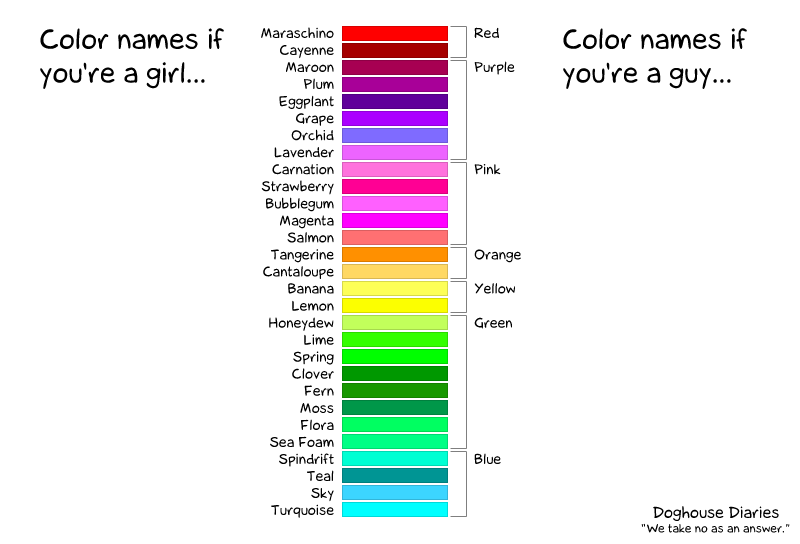
At this stage, it is worth noting that not everyone experiences colours in the same way. Some people are colour-blind, whether by deuteranomaly, deuteranopia, protanomaly, or protanopia, and so it is worth checking that your visualisations are accessible to them.6 Others are less sensitive to colour distinctions. The old trope is that males are less sensitive to colour distinctions:7
Seeing what others see
About one man in twelve, and one woman in two hundred, sees colour differently from the palette designer. The most common form, deuteranopia, confuses reds with greens — which is precisely the pairing a “stop/go” palette relies on.
autograph gives you two functions for checking this.
simulate_colorblind() shows you a set of colours as such a
viewer sees them, and check_separation() scores how far
apart colours are, taking the worst case across normal vision and each
type of colour blindness. A score below 10 means two colours are easily
confused, 10 to 25 that they are separable but close, and above 25 that
they are comfortably distinct.
# A red and a green that look quite different to most viewers
check_separation(c("#B7352D", "#627313"))
# But not to everyone
simulate_colorblind(c("#B7352D", "#627313"), "deutan")
Run the code, then try "protan" or
"tritan" instead of "deutan".
How far the simulation goes is set by severity. Full
severity, the default, is dichromacy: deuteranopia, protanopia,
tritanopia. A lower severity is anomalous trichromacy — deuteranomaly,
protanomaly — which is the more common condition, and which the
paragraph above named without being able to show you.
simulate_colorblind(c("#B7352D", "#627313"), "deutan", severity = 1)
simulate_colorblind(c("#B7352D", "#627313"), "deutan", severity = 0.4)
You can also look at a whole graph the way another viewer would, by mapping the simulated colours back onto it.
graphr(fict_lotr, node_colour = "Race")
graphr(fict_lotr, node_colour = "Race") +
  ggplot2::scale_fill_manual(values = simulate_colorblind(ag_qualitative(6), "deutan"))
Much of this work is already done for you. Each theme’s palette is reordered when the theme is set, so that the colours a graph uses first are the ones that stay distinct for every viewer, and each divergent palette pairs a warm pole with a cool one rather than a red with a green.
stocnet_theme("iheid")
round(check_separation(ag_qualitative(4)))
# The closest pair among those four colours
min(check_separation(ag_qualitative(4)), na.rm = TRUE)
stocnet_theme("default")
Going further:
The "rainbow" theme is the exception, and is left in the
order of the spectrum, since that fidelity is its point. A spectrum is
not a colour-blind safe scheme: its reds and greens are the pair that
red-green colour blindness cannot separate. Choose it where the order of
your categories is itself meaningful, and check the result with
check_separation(). Where you need particular colours in an
institutional palette, match_color() finds the closest the
palette has to those you ask for.
Greyscale
Other times colour may not be desired. Some publications require greyscale images, and a figure may be photocopied whether or not you meant it to be. A greyscale device keeps the luminance of a colour and throws the rest away, so two colours of the same lightness merge, however different their hues. This is why ColorBrewer marks a palette print-safe and photocopy-safe separately from marking it colour-blind safe: they are different questions, and a palette can pass one and fail the other.
simulate_colorblind() answers the second with
type = "grey", and check_separation() reports
the greyscale distances beside its own score.
The matrix is what every viewer can see. The line beneath it is what survives a photocopier. Most institutional palettes separate their categories by hue, so most of them collapse in greyscale.
To draw in greyscale from the start, replace _hue from
above with _grey (note the ‘e’ spelling):
graphr(fict_lotr,
           node_colour = "Race") +
  ggplot2::scale_fill_grey()
As you can see, greyscale is more effective for continuous variables
or for very few discrete categories than for the six categories used
here. If you need to distinguish several categories in print, consider
combining greyscale with node_shape, or use the
"bw" theme, which is designed for this purpose.
stocnet_medium("print") is the companion to this; see
Where will it be seen? below.
Manual override
Or we may want to choose particular colours for each category. This
is pretty straightforward to do with
ggplot2::scale_fill_manual(). Some common colour names are
available, but otherwise hex colour codes can be used for more specific
colours. Unspecified categories are coloured (dark) grey.
graphr(fict_lotr,
           node_colour = "Race") +
  ggplot2::scale_fill_manual(
    values = c("Dwarf" = "red",
               "Hobbit" = "orange",
               "Maiar" = "#DEC20B",
               "Human" = "lightblue",
               "Elf" = "lightgreen",
               "Ent" = "darkgreen")) +
  labs(fill = "Colour")
Where will it be seen?
A theme says how a plot should look. Where it will be seen is a separate question, and the answer changes more often than the theme does. The same institutional theme has to serve a figure worked on at a desk, projected in a lecture theatre, printed in an article, and read on a phone in a narrow column. Each of those wants a different size of text, and one of them wants a different background.
stocnet_medium() sets this, and leaves the theme
alone.
stocnet_medium()
stocnet_medium("presentation")
graphr(fict_lotr, node_colour = "Race")
stocnet_medium("screen")
The media are "screen" (the default),
"presentation", "mobile", and
"print". The first three differ in the size of their text;
ag_size() reports the multiplier in force.
"print" leaves the text alone and draws on white, whatever
ground the theme prefers, since a dark or tinted ground costs ink and is
often not reproduced. As with stocnet_theme(),
persist = TRUE remembers your choice.
The medium scales text, not marks. A node’s size is relative to the
layout it sits in, so enlarging the nodes without enlarging the layout
would only crowd it. Use node_size in graphr()
where a figure needs larger nodes too.
Nor does the medium set the size of the file you write. Give
ggsave() the width, height, and resolution to match; see
Exporting plots below.
Going further: A
small figure limits how much it can carry, not just how large the type
is. Keep a legend to about seven keys, and graphs() to
about three panels. graphr() says so when a colour or shape
legend grows past that, because past it a reader stops matching keys to
marks and starts guessing. Splitting one crowded figure into two that
each make a single point is almost always better than shrinking the type
until it fits.
In brief:
stocnet_theme() sets a theme once for all subsequent graphs
and plots, with institutional and stylistic palettes included, and
persist = TRUE keeps it for future sessions. Individual
graphs can still be adjusted by appending
ggplot2::scale_fill_*() functions — _hue() for
a different palette, _grey() for print,
_manual() for hand-picked colours — and
simulate_colorblind(), check_separation() and
check_contrast() check that your palette works for
colour-blind viewers, in greyscale, and as text.
stocnet_medium() then sizes the result for where it will be
seen.
Layouts
On this page: Spectral · Layered · Circular · Grid · Force-directed · Manual
Unlike the maps and scatterplots you may be used to, where a node is drawn on a network graph is usually not data. Its position is chosen by an algorithm to make the structure readable, and a different algorithm would have put it somewhere else. Knowing which algorithm drew a graph — and so what can and cannot be read off the positions in it — is the point of this section.
It helps to sort layouts by how much of a node’s position is data. We start with layouts where both coordinates mean something, and work our way down to those where the position is only there to keep the picture legible:
| Layouts | What a node’s position means |
|---|---|
Spectral: "eigen", "scaling",
"correspondence"
|
Both axes are calculated from the network |
Layered: "layered", "railway",
"lineage", "ladder"
|
One axis is data: a mode, a rank, a generation, a year |
Circular: "concentric", "circle"
|
The ring a node is on, or its place around it, can be data |
Grid: "grid", or any layout with
snap = TRUE
|
Regular positions, chosen to keep labels apart |
Force-directed: "stress", "fr",
"kk"
|
A compromise, chosen to keep the whole drawing legible |
Manual: x = and y =
|
Whatever you decide |
Here is one network drawn by one layout from each of the first five rows. Nothing about the network changes from panel to panel; only what you can read from it does.
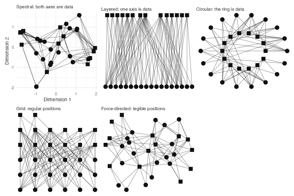
Graph layouts available in the igraph,
ggraph, graphlayouts, and
autograph packages can be used in graphr().
These can be specified using the layout argument. For these
examples we will mostly use ison_southern_women, a
classical
two-mode network of women attending events, because
two-mode networks make the differences between layouts especially
visible.
Spectral layouts
Spectral layouts are the nearest a network graph comes to a scatterplot. Both axes are calculated from the network, and a node’s coordinates are its scores on them, so that nodes drawn together are similar in some measured sense. autograph offers three, which differ in what they take ‘similar’ to mean:
- the eigenvector layout draws together nodes that are tied to the same others;
- multidimensional scaling draws together nodes that are few steps apart;
- correspondence analysis draws together nodes whose rows in a table of ties look alike.
All three are careful about position and careless about legibility: nodes pile up on top of each other, and ties run long and cross often. The rest of this page gradually reverses that trade.
Eigenvector layout
The eigenvector layout starts from a matrix. The Laplacian
of a network is a table with a row and a column for every node, which
records each node’s degree on its diagonal and marks each pair of nodes
that are tied. Like any such table, it can be broken down into
eigenvectors: a series of axes, each of which gives every node
a single score. The "eigen" layout takes two of them, the
two along which the scores change least from a node to the nodes it is
tied to, and draws one as x and the other as y.
Three things follow from choosing axes this way. Tied nodes get similar scores, so a tightly knit group is drawn close together. Nodes tied to exactly the same others get exactly the same scores, and are drawn on top of each other. And the few nodes that connect one group to another are pulled out along an axis, somewhere between the two. You can see all three in about the simplest network that has groups at all: three groups of four, in which everyone is tied to everyone else in their group, joined in a chain by two ties.
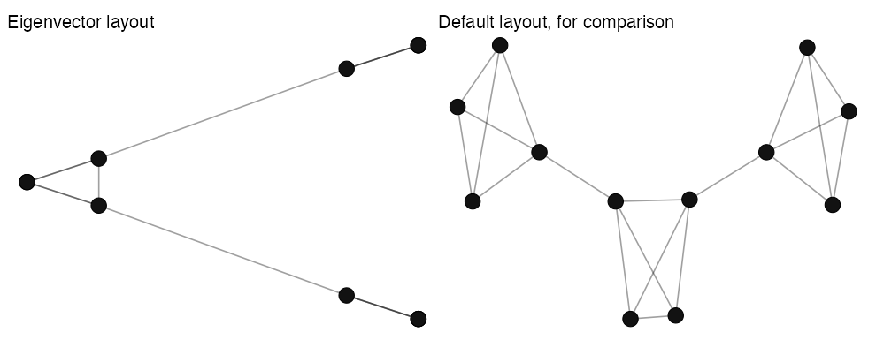
Both panels draw the same twelve nodes, but on the left you can count only seven. In each of the groups at the ends of the chain, three members share all their ties, and so share one position; the member that holds the tie to the middle group is drawn a little towards it. The middle group, tied to both of the others, is drawn between them. The drawing has lost almost everything about the network except the one thing it is for: there are three groups here, this is the order they come in, and these are the nodes that join them.
So this is how to read an eigenvector layout:
- do read which cluster a node falls in, and which side of an axis it is on: the first axis marks the deepest division in the network;
- do read the nodes strung out between clusters as the ones that connect them;
- do not read a distance as a number of steps, or count the nodes in a clump, since several may be hiding behind one.
Now draw the Southern Women this way. Which women are drawn on the same side as which events?
Real networks are rarely as tidy as three groups in a chain, but the same reading applies: the women and events at either end of the horizontal axis are those that had least to do with each other, and those drawn between them took part on both sides.
Multidimensional scaling
Of similar purpose are multidimensional scaling (MDS) techniques,
which visualise the similarity between nodes in terms of their proximity
in a two-dimensional (or more) space. The "scaling" layout
places the nodes so that the distance drawn between them stands for the
number of steps between them in the network.
Note that this layout is drawn with the axes labelled, whereas you
may have noticed that the other graphs are not. That is because here the
coordinates can be read: two nodes drawn twice as far apart are, more or
less, twice as far apart. The axes are drawn on one scale for the same
reason. The layout scales the whole network where it is small enough for
that, using "mds" from igraph, and otherwise
approximates the scaling from a sample of the nodes using
"pmds" (or pivot MDS) from graphlayouts. You
can still call each of these directly, but since they are both used in
"scaling", dispatch can be automatic, based on the size and
structure of the network.
“More or less” is doing some work in that sentence. A network usually has more structure than two dimensions alone can hold, so some of the distances drawn will not match the distances in the network. How far they miss is called the stress of the drawing, and the caption under the plot reports it, as a percentage, where zero would be a perfect drawing. The next page, Checking layouts, shows how to read that number, and how to obtain it for any other layout.
Try it yourself:
This section includes an interactive quiz in the live tutorial — run
run_tute() at the R console to try it.
Correspondence analysis
Whereas scaling lays out nodes by their distances from each other, correspondence analysis (CA) lays them out by the similarity of their ties. This is useful where nodes may not be tied to each other at all, but can be tied to the same others, such as in a two-mode network. Correspondence analysis takes a rectangular table — here the incidence matrix of the Southern Women dataset, one row for each woman and one column for each event — and places its rows and its columns in one space.
We can see the similarity to the eigenvector layout above, but here the axes are labelled with the share of the network’s inertia they hold. Inertia is the CA analogue of variance in PCA. It measures the total dispersion of points (rows and columns) in the cloud around the centroid, computed as the chi-square statistic of the table divided by the total sample size (N). In other words, inertia tell us how far the ties depart from what one would expect if every woman attended events in the same proportion as every other. A network whose nodes all had much the same ties would have almost none.
Since the two dimensions hold different shares here, we can see where to put the emphasis of our interpretation. Because the first dimension holds twice as much as the second, what distinguishes nodes most runs along the x-axis rather than the y-axis. Whether those shares are large enough for the plot to be worth interpreting is a question for the next page, Checking layouts.
One thing to keep in mind whenever you read a correspondence analysis: while the distances among nodes of the same mode are interpretable, distances between nodes from different modes are not necessarily interpretable. That is, a woman drawn near an event is not necessarily an attendee of it. Only the distances within a mode can be read this way: two women drawn together attended similar events, and two events drawn together were attended by similar women. These plots are often misread this way.
For a directed network, each node has two profiles: who it sends ties
to, and who it receives them from. By default the layout reads a tie in
either direction, so that each node has one position;
direction = "out" and direction = "in" read
one profile or the other. For a signed network there is no
correspondence analysis at all, since the method divides by the mass of
each node and a negative tie has no such reading.
double = TRUE splits each tie into a positive and a
negative part, so that a node is placed by both who it likes and who it
dislikes.
Try it yourself:
This section includes an interactive quiz in the live tutorial — run
run_tute() at the R console to try it.
Layered layouts
Layered layouts give up one of the two axes. One axis is still data — it says which layer a node belongs to — while the other is used only to arrange the nodes within each layer so that their ties cross as little as possible. These layouts are best suited for directed acyclic graphs, two-mode networks, or other data with a natural ordering.
autograph offers four, and they are one layout drawn four ways. Two things vary: which axis the layers run along, and whether the nodes line up across them. The names say which is which — a railway lies flat, a ladder stands up:
| Layers stacked flat | Layers standing up | |
|---|---|---|
| Nodes spaced by their ties | "layered" |
"lineage" |
| Nodes lined up across layers | "railway" |
"ladder" |
graphr(ison_southern_women, layout = "bipartite") + ggtitle("Bipartite")
graphr(ison_southern_women, layout = "layered") + ggtitle("Layered")
graphr(ison_southern_women, layout = "railway") + ggtitle("Railway")
Note that "layered" and "railway" use a
different algorithm to igraph’s "bipartite",
and generally perform better, especially where there are multiple
layers. Whereas "layered" tries to position nodes to
minimise overlaps, "railway" sequences the nodes in each
layer to a grid so that nodes are matched as far as possible. For the
"layered" layout you can also steer which set sits where by
passing a center argument — "events" or
"actors" for a two-mode network, or the name of a
particular node — which helps when the default places the less
interesting set on top.
graphr(ison_southern_women, layout = "layered", center = "events")If you want to flip the horizontal and vertical, you could flip the
coordinates, or use "lineage", which is the same layout
with the axes exchanged.
These layouts serve both multimodal and directed acyclic networks. A
genealogical network offers the clearest case: every tie points from an
earlier generation to a later one. Where a force-directed layout
obscures this ordering, graphr() uses the
"layered" layout to make it clear. Draw the parent
ties among the characters of Westeros.
thrones <- to_uniplex(fict_thrones, "parent")
graphr(thrones)
This layout tries to minimise two costs. The first is which layer
each node goes in. Ranking each node by its distance from a root sounds
right — a row is then a generation — but it pins a parent whose only
child is born several generations later to the top row, and manufactures
a long tie to reach them. The ranks argument chooses the
rule, and check_span() reports how many rows each tie
crosses, so you can measure the difference.
thrones <- to_uniplex(fict_thrones, "parent")
spans <- sapply(c("generation", "compact", "tight"), function(r) {
  span <- check_span(graphr(thrones, ranks = r))
  c(total = attr(span, "total"), `over one row` = mean(span > 1), max = max(span))
})
round(t(spans), 3)
"generation" is the distance-from-a-root rule and
"compact" is the one igraph uses in its
Sugiyama layout. "tight", the default, minimises total tie
length while still pointing every tie down at least one row. Note that
the longest tie is the same under all three.
The second cost is where each node sits within its row.
check_offset() reports how far each tie travels sideways,
as a share of the width of the drawing, so a tie that drops straight
down scores zero. Again, you are wanting to minimise this, and the
alignment argument chooses the rule. Compare the
two alignments.
thrones <- to_uniplex(fict_thrones, "parent")
c(straight = attr(check_offset(graphr(thrones)), "mean"),
  rungs = attr(check_offset(graphr(thrones, alignment = "rungs")), "mean"))
alignment = "rungs" gives every row the same spacing,
which is what "railway" and "ladder" are for.
The default, "straight", pulls each node towards its
parents and children instead, which is what makes the families read as
families.
ranks also accepts a node attribute, instead of one of
those three rules. Then the layers are that attribute’s values, and
nodes are placed along the axis in proportion to them rather than at
even steps, so a network of dated nodes is drawn as a timeline.
Rank the adolescents by a year of your choosing.
ison_adolescents |> as_stocnet() |>
  mutate_nodes(year = rep(c(1985, 1990, 1995, 2000), times = 2),
               label = paste0(label, " (", year, ")")) |>
  graphr(layout = "lineage", ranks = "year")
Other layered layouts include:
- Tree:
"tree" - Dominance layouts
Circular layouts
Circular layouts give up Cartesian axes altogether and arrange nodes around (potentially concentric) circles, such that crossings are minimised and adjacent nodes are located close together. What is left that can be data is the ring a node is on: in some cases, the ring can be specified by attribute or mode.
The "concentric" layout can also place nodes on rings by
a grouping you choose: pass a membership argument (a node
attribute name, or a vector the same length as the number of nodes).
Ring the Lord of the Rings characters by their
race.
graphr(fict_lotr, layout = "concentric", membership = "Race")Other such layouts include:
- circular:
"circle" - sphere:
"sphere" - star:
"star" - arc or linear layouts:
"linear"
Grid layouts
Grid layouts arrange nodes at regular Cartesian coordinates. Here the positions are no longer data at all: they are evenly spaced because even spacing is tidy. These can be useful for making sure all nodes’ labels are visible, but horizontal and vertical lines can overlap, making it difficult to distinguish whether some nodes are tied or not.
Other grid layouts include:
- orthogonal layouts for e.g. printed circuit boards
- grid snapping for other layouts
That last point deserves a demonstration. Rather than committing to a
full grid, graphr()’s snap = TRUE argument
keeps whatever layout you asked for but snaps its coordinates onto a
grid — trading a little positional accuracy for the label legibility of
a grid. Compare the stress layout with its snapped
version.
Try it yourself:
This section includes an interactive quiz in the live tutorial — run
run_tute() at the R console to try it.
Force-directed layouts
Force-directed layouts complete the trade this page has been making. They give up position as data entirely, in exchange for a drawing in which tied nodes sit near each other, untied nodes keep apart, and the ties are of a similar and readable length. This is why one of them is the default layout for most networks, and why you have been looking at them since your first graph.
Force-directed layouts update some initial placement of vertices through the operation of some system of metaphorically-physical forces. These might include attractive and repulsive forces.
(graphr(ison_southern_women, layout = "kk") + ggtitle("Kamada-Kawai") |
   graphr(ison_southern_women, layout = "fr") + ggtitle("Fruchterman-Reingold") |
   graphr(ison_southern_women, layout = "stress") + ggtitle("Stress Minimisation"))
The Kamada-Kawai (KK) method inserts a spring between all pairs of vertices that is the length of the graph distance between them. This means that edges with a large weight will be longer. KK offers a good layout for lattice -like networks, because it will try to space the network out evenly.
The Fruchterman-Reingold (FR) method uses an attractive force between directly connected vertices, and a repulsive force between all vertex pairs. The attractive force is proportional to the edge’s weight, thus edges with a large weight will be shorter. FR offers a good baseline for most types of networks.
The Stress Minimisation (stress) method is related to the KK algorithm, but offers better runtime, quality, and stability and so is generally preferred. Indeed, autograph uses it as the default for most networks. It has the advantage of returning the same layout each time it is run on the same network.
Try it yourself:
This section includes an interactive quiz in the live tutorial — run
run_tute() at the R console to try it.
Other force-directed layouts available include:
- Simulated annealing (Davidson and Harel 1993):
"dh" - Graph embedder (Frick et al. 1995):
"gem" - Graphopt (Schmuhl):
"graphopt" - Distributed recursive graph layout (Martin et al. 2008):
"drl"
Manual layouts
Whatever their differences, all these layout algorithms do the same
job: they return a table of node coordinates. Nothing stops you
computing that table yourself, inspecting it, adjusting a coordinate or
two, and handing the result back to graphr() via its
x and y arguments. This is handy when a layout
is almost right — say one label sits awkwardly, or you want a
particular node set apart — or when you need the same hand-tuned
positions across several figures. Compute a stress layout for
fict_lotr, inspect the coordinate table, banish Gollum to
the top-right corner, and re-graph.
lo <- ggraph::create_layout(as_tidygraph(fict_lotr), layout = "stress")
head(lo[, c("name", "x", "y")])
lo$x[lo$name == "Gollum"] <- max(lo$x) + 1
lo$y[lo$name == "Gollum"] <- max(lo$y) + 1
graphr(fict_lotr, x = lo$x, y = lo$y)
The same trick lets you reuse a layout across plots (compute once,
pass the same x/y to each call), which keeps
node positions identical between figures — useful when readers need to
compare them.
Going further:
autograph also provides its own special-purpose layouts —
"configuration", "correspondence",
"levels", "matching", "scaling",
"valence", and the layered family — documented at
?layout_layered and friends. Several layouts take a
layout-specific extra argument (passed through ...) to
control how nodes are ordered: "concentric" a
membership, "levels" a level, and
the layered layouts ranks — each a node attribute name or a
vector. See ?graphr for the full list.
In brief: Pass
layout = to graphr() to choose among spectral
("eigen", "scaling",
"correspondence"), layered ("layered",
"railway", "lineage"), circular
("concentric", "circle"), grid, and
force-directed ("stress", "fr",
"kk") layouts. The order matters: spectral layouts place
nodes by measured similarity, so their positions can be read; layered
layouts make one axis mean something, which suits two-mode or
hierarchical data; force-directed layouts are illustrative — do not
over-interpret distances in them. And since every layout is just a table
of coordinates, you can always compute one with
ggraph::create_layout(), adjust it, and pass it back via
graphr()’s x and y arguments.
Checking layouts
On this page: Legibility · Layers · Faithfulness · Free play
The last page sorted layouts by what their positions mean. This page
asks a second question of any one drawing: is it any good? There are two
quite different ways for a drawing to be good. It can be
legible: easy on the eye, with ties you can follow. And it can
be faithful: its distances can stand for distances in the
network. Each check_*() function below scores one of these
qualities, and each scores a drawing rather than the network it
draws, so that two layouts of the same network can be compared.
Legibility
Researchers who study graph drawing have identified a number of features that make a drawing easier or harder to read. Each of the following four comes with a pair of drawings of one small network: the same nodes and the same ties, only placed differently. The score in each title is calculated from the drawing beneath it.
Crossings
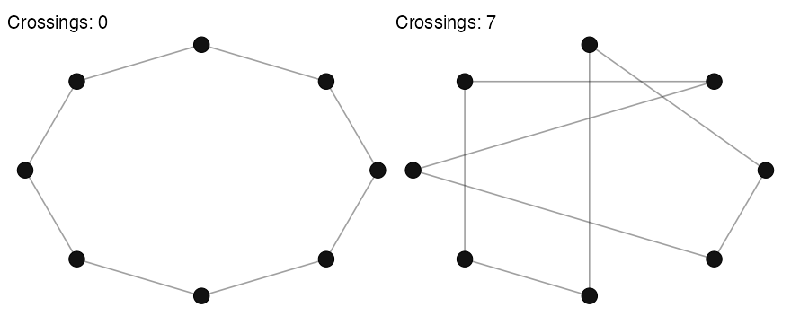
Ties that cross are hard to follow, and a reader can mistake a
crossing for a node. check_crossings() counts the crossings
in a drawing. A ring of eight nodes can be drawn with none at all; place
the same nodes around the same circle in another order, and the same
eight ties cross repeatedly. (A graph that can be drawn with no
crossings is called planar; many
cannot.)
Slopes
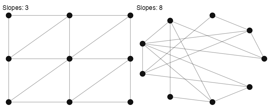
A drawing whose ties run in only a few directions looks ordered, and
one whose ties run in every direction looks busy.
check_slopes() counts the different slopes that the ties
are drawn at. A
lattice drawn on a grid needs only three; the same lattice
drawn around a circle needs many more.
Lengths
Long ties are hard to follow from one end to the other, and ties of
very different lengths suggest differences that are not in the data: a
long tie reads as a weak or distant one, whether or not it is.
check_lengths() measures each tie as a share of the
diagonal of the drawing, and reports their total, their maximum, and how
much they vary ("cv", the coefficient of variation, which
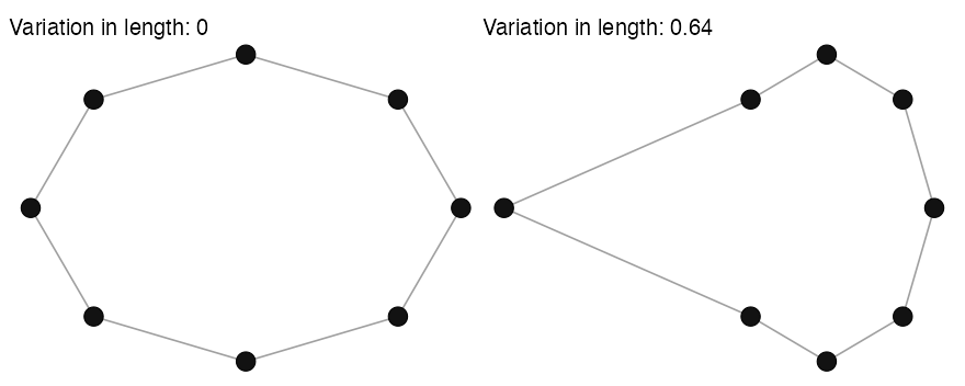
is zero where every tie is the same length). Pull one node of the ring
away from the others, and two ties stretch while the rest stay as they
were.
Angles
Where several ties meet at a node, they are easiest to tell apart
when they leave it in well separated directions.
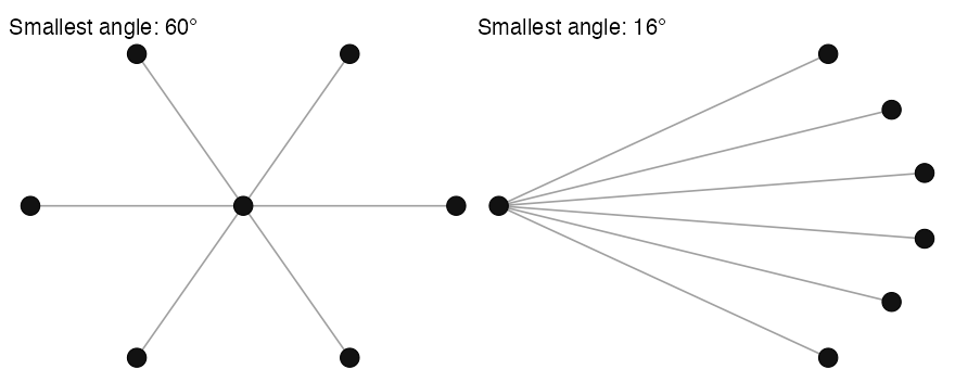
check_angles() reports the smallest angle between two ties
at each node, and the smallest of those is the angular
resolution of the drawing. A star with six leaves can give every
tie 60° of room; gather the same leaves on one side of the centre, and
the ties crowd together.
All at once
check_drawing() runs all four of these checks at once,
beside check_stress(), which we will come to under
Faithfulness below. Compare a stress layout with a
circle.
sw_stress <- graphr(ison_southern_women, layout = "stress")
sw_circle <- graphr(ison_southern_women, layout = "circle")
rbind(stress = check_drawing(sw_stress), circle = check_drawing(sw_circle))
Every column is read downwards except angle_min, which
is read upwards. Fewer crossings, fewer slopes, shorter ties, more even
ties, and a wider smallest angle all make a drawing easier to read.
nodes, ties and angle_ideal are
context rather than scores. angle_ideal is the widest
smallest angle the degrees of this network allow, so
angle_min is read as a share of it. The floors are worth
knowing as well: a network of this many ties cannot be drawn without
crossings at all, and no drawing of it can use fewer slopes than half
its largest degree.
No layout wins on every measure. The circle draws every node on one ring, which costs it crossings and length: it draws many times the crossings of the stress layout, and three times the total tie length. It buys the other measures with the same ring: fewer slopes, ties of a more even length, and more room between the ties that meet at a node. Its stress is the worse of the two, because a layout that never set out to draw the path distances scores poorly on them by design.
A few other qualities are sometimes asked of a drawing but are not
measured here: the number of bends in its ties (which
graphr()’s edge_bundle argument sets, rather
than the layout), the size and aspect ratio of the box it fits in, and
how well it displays the symmetries of the network.
Layers
Layered layouts have two legibility checks of their own, which you
met with the family tree of Westeros in Layered layouts:
check_span() counts how many rows each tie crosses, and
check_offset() measures how far each tie travels sideways.
Both are costs. A tie that runs to the next row is easy to follow; one
that passes over a row has to find its way between the nodes on it. Each
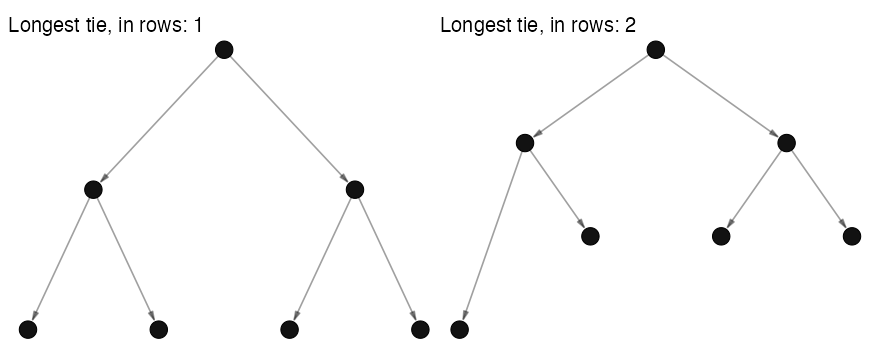
of the six ties in a small tree runs to the next row. Move one leaf down
a row, and its tie crosses two rows instead of one, so that the total
over all the ties rises from six rows to seven.
Faithfulness
A legible drawing is not necessarily a faithful one. Where a layout claims that its distances are data, as the spectral layouts on the last page did, we should ask how far to believe it.
Stress
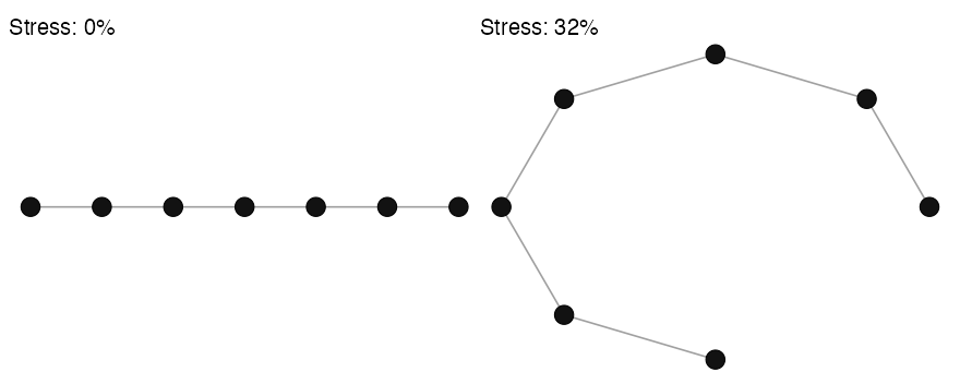
Stress measures the disagreement between the distances drawn and the distances in the network, counted as the number of steps from one node to another. It is a percentage of the network distances, such that zero would represent a perfect drawing. A path of seven nodes drawn as a straight line is one: every pair of nodes is drawn exactly as far apart as it is steps apart. Bend the same path around a circle, and its two ends, six steps apart, are drawn almost as neighbours.
How low is low? Kruskal (1964), who introduced the score, recommends 20% as poor, 10% as fair, 5% as good, and 2.5% as excellent. Those figures were established for psychometric data though. Networks typically contain a lot more structure, which is hard to capture in just two dimensions, so a 20% threshold is often too demanding.
For networks, a score near 30% is quite common, and means the
clustering can be interpreted though perhaps the distances should not be
interpreted as exact. Above 40% and the plot does not really show any
interpretable structure; graphr() will alert you in the
console where the score is above 30%. By contrast, a stress score near
5% is rare and worth trusting.
Note that this stress score is not only for the
"scaling" layout. check_stress() measures any
drawing the same way, so layouts can be compared on the same network
(Brandes and Pich 2007):
sapply(c("scaling", "stress", "fr", "circle"),
       function(x) check_stress(graphr(ison_southern_women, layout = x)))
The default "stress" layout scores a little better here,
which is no accident: it minimises a related criterion directly. What
"scaling" adds is the axes and the score, so that the
distances can be read and the reading can be checked.
In addition to stress, the "scaling" layout also reports
how much of the variance in the network’s distances the two dimensions
drawn hold. The two numbers answer different questions, and the
comparison above shows how. Stress belongs to the drawing: draw this one
network four ways and you get four different scores. The variance
explained belongs to the network: it is the same 31% whichever of the
four you draw, because it asks how much of the structure two dimensions
could hold at all.
So read them together. A low variance explained sets a floor that no layout gets under. Where two dimensions can hold only a third of the structure, no arrangement of the nodes will draw the distances faithfully, and stress tells you how close to that floor this particular drawing gets.
Try it yourself:
This section includes an interactive quiz in the live tutorial — run
run_tute() at the R console to try it.
Inertia
Correspondence analysis has its own measure of how much the two dimensions drawn hold, which you saw on its axis labels: each one’s share of the network’s inertia.
Each dimension extracted captures a share of this total inertia.
Because it is a share of variance explained, and not a measure of fit
like regression’s R-squared, the scores depend on the number of
dimensions. ison_southern_women has 12 dimensions, and a
total inertia of 1.65. The top two dimensions (in terms of variance
explained) together account for 57% of this total inertia.
Is this good? I.e. is this a presentation of the data that is worth interpreting? Well, if the inertia were spread evenly across these 12 dimensions, (any) 2 dimensions would jointly account for about 17% of the variance. 57% is about 3.4 times better than this. But this flatters because inertia is never spread evenly (Jackson 1993). The broken stick model offers a more demanding baseline, asking what two dimensions would hold if the inertia were divided randomly rather than evenly (here 1.3 times better):
bstick <- function(K) sum(sapply(1:2, function(k) mean(1 / (k:K))))
sapply(c("ison_southern_women", "ison_adolescents", "ison_networkers"),
       function(x) {
         fit <- attr(layout_correspondence(get(x)), "fit")
         K <- length(fit$scree)
         c(dimensions = K,
           inertia_drawn = round(sum(fit$inertia), 2),
           vs_even = round(sum(fit$inertia) / (2 / K), 1),
           vs_random = round(sum(fit$inertia) / bstick(K), 1))
       })
ison_adolescents looks the best summarised by two
dimensions of three datasets considered at 60%. However, it is a small
network with only seven dimensions to spread across, so two of them were
always going to hold a good deal. Against the harder baseline it scores
below 1, which is to say two dimensions hold less than dividing
the inertia at random would have given them. By comparison,
ison_networkers looks the worst at 36% and yet summarises
best: it has 31 dimensions, and the top two beat either baseline. Note
that these scores are not verdicts, but help gauge whether the two
dimensions presented are worth interpreting further.
graphr() applies the stricter of the two baselines for you,
noting at the console where two dimensions hold no more inertia than a
random division would have given them.
Cos2
A share of inertia describes the plot as a whole. But some nodes are
better represented by the top two dimensions than others. A plot can
hold most of the network’s inertia and still put one particular node
nowhere near where it belongs. This representation is captured by a
measure called cos2: how much of its position the two
dimensions drawn actually hold, from 0 to 1, where lower is worse. A
node the plane captures badly may be located near the centre of the
plot, not because it is average, but because there is nowhere else to
put it. graphr() names these nodes in the console when it
draws the layout, but you can recover the scores like so:
fit <- attr(layout_correspondence(ison_southern_women), "fit")
round(sort(fit$cos2), 2)
Try it yourself:
This section includes an interactive quiz in the live tutorial — run
run_tute() at the R console to try it.
Free play
Your turn: the create_*() functions
from manynet make networks with one very regular
structure each, which makes them ideal for finding out what each check
rewards. The code below draws a ring, a star, a lattice, and a tree with
one layout, and checks each drawing. Change the layout to
"stress", "grid", "star", or
"tree". Which network and layout together give the fewest
slopes? The most even ties? The widest smallest angle? And can you find
a layout that draws the lattice without any crossings?
nets <- list(ring = create_ring(12), star = create_star(12),
             lattice = create_lattice(12), tree = create_tree(12))
do.call(rbind, lapply(nets, function(net) {
  check_drawing(graphr(net, layout = "circle"))
}))
In brief: A drawing can be checked for how legible it is and for how faithful it is, and the two often pull apart.
| Check | Function | Better when | A layout that aims for it |
|---|---|---|---|
| Crossings | check_crossings() |
lower |
"layered", "stress"
|
| Slopes | check_slopes() |
lower |
"grid", "circle"
|
| Tie lengths | check_lengths() |
shorter and more even |
"stress", "fr"
|
| Smallest angle | check_angles() |
higher |
"circle", "star"
|
| Rows crossed, sideways travel |
check_span(), check_offset()
|
lower |
"layered" and its family |
| Stress | check_stress() |
lower |
"stress", "scaling"
|
| Inertia and cos2 | layout_correspondence() |
higher | "correspondence" |
check_drawing() reports the first four and stress
together. No layout wins on every measure, so choose the checks that
matter for what you want your reader to see.
Ew, hairballs
On this page: Isolates · Bundling · Backbones
Sometimes no layout helps. Whichever one you choose, the drawing
comes out as a dense hairball, and check_crossings() only
confirms what you can already see. ‘Hairball’ is a technical term to
describe networks with many high-degree nodes and many ties, where the
sheer number of ties obscures any structure that might be in the
network. Autograph includes three arguments that can help with this,
some of which are turned on by default, so we will need to turn them off
to see the effect of each in isolation.
Isolates
First, it is possible that the hairball is not a hairball at all, but a network with many disconnected components or, especially, isolates , that each need to be drawn. As each component is drawn under a force-directed layout, the components will repel each other and the giant component will be squeezed into a clump.
The isolates argument in graphr() provides
some options for what to do with them instead: "legend"
(the default) drops them from the drawing but records how many there
were in the legend, "caption" notes them in a caption
instead, and "keep" leaves them in place. Add ten
unconnected characters to fict_lotr and compare keeping
them with noting them in the legend.
Bundling ties
The second option is to draw all of the ties ‘bundled’ together,
which can reveal where the most common paths through the network are.
edge_bundle pulls ties that travel in similar directions
into shared paths — like cabling them together — so that the main
‘highways’ of the network stand out. It is off by default; set
edge_bundle = TRUE (or name a specific algorithm:
"force", "path", or "minimal") to
switch it on. ison_lawfirm records 71 lawyers and
2571 ties between them, which is about as thick a hairball as a network
this small can be. Compare it drawn with and without bundling (turn
backbone off too for clearest comparison results).
graphr(ison_lawfirm, backbone = FALSE) + ggtitle("Unbundled") |
  graphr(ison_lawfirm, backbone = FALSE, edge_bundle = "path") + ggtitle("Bundled")
I find this works best with networks that are at least moderately dense, and sometimes requires a little bit of playing around to get a good result.
Backbones
By contrast,
backbone changes which ties the picture is built around.
Ties that carry more weight/structure than expected by a null model
local to their endpoints are in essence what the network would be if it
were stripped back to its skeleton. graphr() then draws the
layout according to this skeleton and fades other ties into the
background to further emphasise the main structure.
Most of the time you will not have to ask for this. Networks of 50+
nodes with 8 ties each on average is drawn this way by default. But you
can specify backbone = FALSE to turns it off,
backbone = TRUE to force it on, or you can name a filter —
"disparity", "lans", "noise",
"mlf", or "simmelian" — or threshold.
Compare ison_lawfirm drawn with and without its
backbone.
(graphr(ison_lawfirm, node_colour = "office", backbone = FALSE) +
   ggtitle("Every tie alike") |
   graphr(ison_lawfirm, node_colour = "office", backbone = TRUE) +
   ggtitle("Backbone"))
The offices are hardly visible on the left. On the right they separate, because the ties that hold each office together are the ties the filter keeps.
Only the layouts that read tie lengths are laid out this way:
"stress" (the default), "fr",
"drl" and "kk". Every other layout, including
those whose coordinates already mean something such as
"layered" or "scaling", keeps its coordinates
and only fades its ties. Signed networks have no backbone, since these
null models have no place for a negative weight, and are drawn as they
were.
Bundling and backbones answer the same problem from different ends, so try one before reaching for both. A bundled tie cannot carry a fading of its own — bundling merges ties into shared paths — so where both are asked for, the backbone still shapes the layout but every tie is drawn alike.
For very large real-world networks such as irps_blogs,
these work well together: a backbone picks out the ties that hold the
connected core together (or edge_bundle = TRUE, if you
would rather see the paths the ties take than which of them matter
most), while isolates = "legend" keeps its several hundred
unconnected blogs from crowding that core out.
In brief: Where a
network is too dense or too scattered for any layout to draw legibly,
change what is drawn rather than where: isolates takes
unconnected nodes out of the drawing and into the legend or caption,
edge_bundle gathers ties that run the same way into shared
paths, and backbone lays the network out by the ties that
matter most and fades the rest.
Multiple graphs
On this page: Arrangements · Sets · Dynamics
Sometimes one graph is not enough: we want to compare two networks, several subgraphs, or the same network at different points in time.
Arrangements
autograph uses the patchwork package
for arranging graphs together, e.g. side-by-side or above one another.
The syntax is quite straightforward and is used throughout these
vignettes/tutorials. Basically, you just use + or
| to put graphs side-by-side, and / to put
them above one another. Parentheses can be used to group graphs
together. Try graphing fict_lotr and
ison_algebra side-by-side, and then one above the
other.
Sets
graphr() is not the only graphing function included in
autograph. To graph sets of networks together,
graphs() makes sure that two or more networks are plotted
together, using a consistent layout and theme across the panels so that
they can be compared. This might be a set of ego networks,
subgraphs , or waves of a
longitudinal network.
graphs(to_subgraphs(fict_lotr, "Race"),
       waves = c(1,2,3,4))
What is happening here is that to_subgraphs() is
creating a list of subgraphs — one per race — and then
graphs() is plotting them together at once with the same
set of aesthetic parameters. The waves argument selects
which networks in the list to plot — here the first four of the six race
subgraphs. Left to its own devices, graphs() plots just the
first and last networks of longer lists, which suits before-and-after
comparisons of longitudinal networks.
When the panels share the same nodes, graphs() computes
a single layout and reuses it across panels so that positions line up
and can be compared; by default it uses the "first"
network’s layout, but based_on = "last" or
"both" are available. Sharing a layout means every panel
has to draw every node, so in that case isolates are kept in place.
Dynamics
grapht() is another alternative to
graphr(), this time rendering network changes over time as
an animated gif. Longitudinal networks (with discrete waves) and dynamic
networks (with dated changes) are both supported. Nodes appear, move,
and fade as they enter and exit the network, and node positions
transition smoothly between waves. Run the following to animate
a randomly-evolving version of our Lord of the Rings network.
(Be patient — rendering an animation takes considerably longer than
drawing a static graph, and requires the suggested
gganimate and gifski packages.)
fict_lotr |>
  mutate_ties(wave = sample(2001:2012, manynet::net_ties(fict_lotr), replace = TRUE)) |>
  to_waves(cumulative = TRUE) |>
  grapht()
Note that here, as with weight and type in
the previous section, attribute naming matters a little: a time
attribute called wave marks the network as longitudinal for
manynet, so to_waves() (and
grapht() itself, passed such a network directly) will split
it without being told which attribute to use. Any other name (say,
year) works just as well — it only needs declaring via
to_waves()’s attribute argument.
Try it yourself:
This section includes an interactive quiz in the live tutorial — run
run_tute() at the R console to try it.
Going further:
Animation constrains a few things that a static graph allows.
grapht()’s isolates argument takes
"keep" (the default) or "fade" (fading nodes
out in the waves where they have no ties), rather than
graphr()’s "legend"/"caption".
And because they do not translate cleanly from frame to frame,
node_group hulls, edge_bundle, the slight
curve on reciprocated ties, and self-loops are not drawn in animations.
Labels, too, are placed at a fixed offset rather than repelled, and are
hidden by default once a network has more than 30 nodes (pass
labels = TRUE to force them, or select a few as in
graphr(), which is resolved once so the same nodes stay
named in every frame).
Going further with ggraph
For more flexibility with visualisations, autograph
users are encouraged to use the excellent ggraph package.
ggraph is built upon the venerable ggplot2
package and works with tbl_graph and igraph
objects. As with ggplot2, ggraph users are
expected to build a particular plot from the ground up, adding explicit
layers to visualise the nodes and edges. This means more typing, but
near-total control.
library(ggraph)
ggraph(fict_greys, layout = "fr") +
  geom_edge_link(edge_colour = "dark grey",
                  arrow = arrow(angle = 45,
                                length = unit(2, "mm"),
                                type = "closed"),
                  end_cap = circle(3, "mm")) +
  geom_node_point(size = 2.5, shape = 19, colour = "blue") +
  geom_node_text(aes(label=name), family = "serif", size = 2.5) +
  scale_edge_width(range = c(0.3,1.5)) +
  theme_graph() +
  theme(legend.position = "none")
As we can see in the code above, we can specify various aspects of the plot to tailor it to our network.
First, we can alter the layout of the network using
the layout = argument to create a clearer visualisation of
the ties between nodes. This is especially important for larger
networks, where nodes and ties are more easily obscured or
misrepresented. In ggraph, the default layout is the
“stress” layout. The “stress” layout is a safe choice because it is
deterministic and fits well with almost any graph, but it is also a good
idea to explore and try out other layouts on your data. More layouts can
be found in the graphlayouts and igraph R
packages. To use a layout from the igraph package, enter
only the last part of the layout algorithm name (eg.
layout = "mds" for “layout_with_mds”).
Second, using geom_node_point() which draws the nodes as
geometric shapes (circles, squares, or triangles), we can specify the
presentation of nodes in the network in terms of their
shape (shape=, choose from 1 to 21), size
(size=), or colour (colour=). We can
also use aes() to match to node attributes. To add labels,
use geom_node_text() or geom_node_label()
(draws labels within a box). The font (family=), font size
(size=), and colour (colour=) of the labels
can be specified.
Third, we can also specify the presentation of edges
in the network. To draw edges, we use geom_edge_link0() or
geom_edge_link(). Using the latter function makes it
possible to draw a straight line with a gradient. The following features
can be tailored either globally or matched to specific edge attributes
using aes():
colour:
edge_colour=width:
edge_width=linetype:
edge_linetype=opacity:
edge_alpha=
For directed graphs, arrows can be drawn using the
arrow= argument and the arrow() function from
ggplot2. The angle, length, arrowhead type, and padding
between the arrowhead and the node can also be specified.
For more see David Schoch’s excellent resources on this.
Try it yourself:
This section includes an interactive quiz in the live tutorial — run
run_tute() at the R console to try it.
Plotting results
While researchers will probably want to start with using
graphr() to visualise the network itself,
autograph also offers plot() methods for a
number of different network-related objects, so that
plot(result) “just works” without you needing to remember a
special function for each object. These include measures of centrality,
cohesion, and clustering, as well as goodness-of-fit plots for network
models from packages such as RSiena, ergm,
and {MoNAn}. Usefully, all these plots use the same theming
system as graphr(), so that you can set a theme once and
have it apply to all your graphs and plots. Let’s try this now,
plotting the distribution of a centrality measure under two
themes.
stocnet_theme("default")
plot(node_by_degree(fict_lotr))
stocnet_theme("oxf")
plot(node_by_degree(fict_lotr))
stocnet_theme("default")
Each plot shows the distribution of a node measure across the network — here how unequal the characters’ degree centralities are. The other measures that can be plotted this way are introduced in the netrics tutorials. This is a very simple example, but the same principle applies to all plots in autograph: one can set a theme once and have it apply to all plots, and one can always add additional ggplot2 layers to any plot to further customise it — titles and labels, but also trend lines, confidence intervals, and so on. The plot methods for model results are demonstrated in the tutorials of the packages that produce those results.
Exporting plots
We can save the plots we have made by point-and-click by selecting ‘Save as PDF…’ from under the ‘Export’ dropdown menu in the plots panel tab of RStudio.
If you want to do this programmatically, say because you want to
record how you have saved it so that you can e.g. make some changes to
the parameters at some point, this is also not too difficult. After
running the (gg-based) plot you want to save, use ggsave()
to save it to disk:
graphr(fict_lotr, node_colour = "Race")
ggsave("lotr_race.pdf")
ggsave("lotr_race.png", width = 9, height = 6, dpi = 300)
ggsave() infers the file type from the extension
(.pdf, .png, .jpeg,
.svg, …), saves to your working directory unless you
specify a path, and lets you fix the exact width,
height, and resolution (dpi) your publisher
requires. For print, prefer vector formats (.pdf,
.svg), which stay sharp at any size; see
?ggsave for more.
Animations made with grapht() are saved slightly
differently: use gganimate::anim_save("my_animation.gif"),
which works just like ggsave() but for the last animation
rendered.
Try it yourself:
This section includes an interactive quiz in the live tutorial — run
run_tute() at the R console to try it.
Summary
Well done — you have completed the tutorial on visualising networks! Along the way, you have learned to use these functions:
| Function | What it does |
|---|---|
graphr() |
graphs any manynet-compatible network with sensible defaults |
graphr(..., node_colour/node_shape/node_size/node_group) |
maps node attributes to aesthetics |
graphr(..., edge_colour/edge_size) |
maps tie attributes to aesthetics |
graphr(..., edge_arrows) |
resizes or removes the arrowheads of directed ties |
graphr(..., labels, label_repel, label_dist) |
chooses which nodes to label, and places the labels |
graphr(..., layout, snap) |
chooses and adjusts the layout algorithm |
graphr(..., x, y) |
places nodes at manually supplied coordinates |
ggraph::create_layout() |
returns a layout’s table of node coordinates for tweaking |
check_drawing(), check_crossings(),
check_slopes(), check_lengths(),
check_angles()
|
score how legible a drawing is |
check_stress() |
scores how faithful a drawing’s distances are |
graphr(..., edge_bundle, backbone, isolates) |
tames large, dense, or disconnected networks |
stocnet_theme() |
sets a consistent theme for all graphs and plots |
ggplot2::scale_fill_hue(), _grey(),
_manual()
|
overrides node colour palettes |
labs(), ggtitle(),
guides()
|
adds titles, and retitles or removes legends |
graphs() |
graphs a list of networks as comparable panels |
grapht() |
animates a longitudinal or dynamic network as a gif |
plot() |
plots measures, motifs, and model results consistently |
ggsave() |
exports the last plot at publication quality |
Try it yourself:
This section includes an interactive quiz in the live tutorial — run
run_tute() at the R console to try it.
When you are ready, continue with the tutorials in the other
{stocnet} packages — on network structure and centrality in
netrics, and on diffusion and regression in
migraph — where the measures you can now visualise are
properly introduced. Run run_tute() at the console to see
all available tutorials.
Glossary
Here are some of the terms that we have covered in this tutorial:
- Backbone
- The backbone of a network comprises the ties that carry more weight, or hold more structure, than a null model local to their endpoints expects.
- Community
- A community is a set of nodes more densely connected to one another than to other nodes in the network.
- Complex
- A complex network is one that includes or can include loops or self-ties.
- Component
- A component is a connected subgraph not part of a larger connected subgraph.
- Degree
- The degree of a node is the number of connections it has.
- Directed
- A directed network is a network where the ties have a direction, from a sender to a receiver.
- Distribution
- A degree distribution is the frequency distribution of the degrees of the nodes in a network.
- Giant
- The giant component is the component that includes the most nodes in the network.
- Homophily
- A tendency for nodes to connect to similar nodes.
- Isolate
- An isolate is a node with degree equal to zero.
- Label
- A labelled network includes unique labels for each node (or ties) in the network.
- Lattice
- A network that can be drawn as a regular tiling.
- Longitudinal
- A longitudinal network is one observed in two or more discrete waves or panels over time.
- Multiplex
- A network that includes multiple types of tie.
- Network
- A network comprises one or more sets of nodes, one or more sets of ties among them, and potentially some node, tie, or network-level attributes.
- Node
- A node or vertex is an entity or actor within a network.
- Reciprocity
- A measure of how often nodes in a directed network are mutually linked.
- Signed
- A signed network is one where ties are marked as positive or negative, such as friendship and enmity or alliance and conflict.
- Subgraph
- A subgraph comprises a subset of the nodes and ties in a network.
- Tie
- A tie, edge, or link is a connection or relationship between two nodes.
- Twomode
- A two-mode (or bipartite) network is a network with two different sets of nodes, where ties connect only nodes from different sets, such as people and the events they attend.
- Undirected
- An undirected or line network is one in which tie direction is undefined.
- Weighted
- A weighted network is where the ties have been assigned weights.